Global Rebranding

Global Rebranding

Steelmar

Strategy, Positioning, Visual Identity System, Commercial Assets.

Blue Economy / Logistics

business card branding

Context

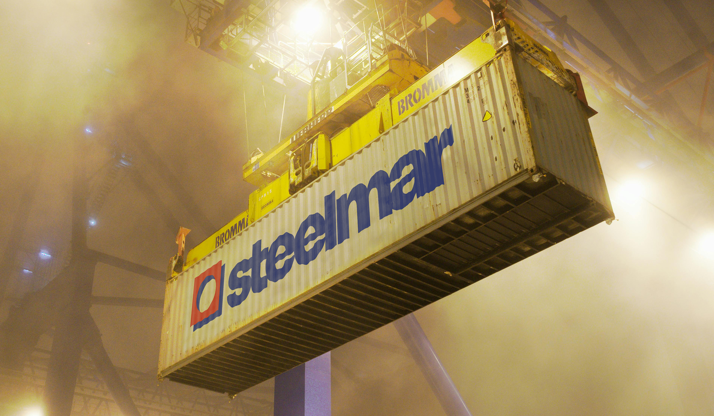
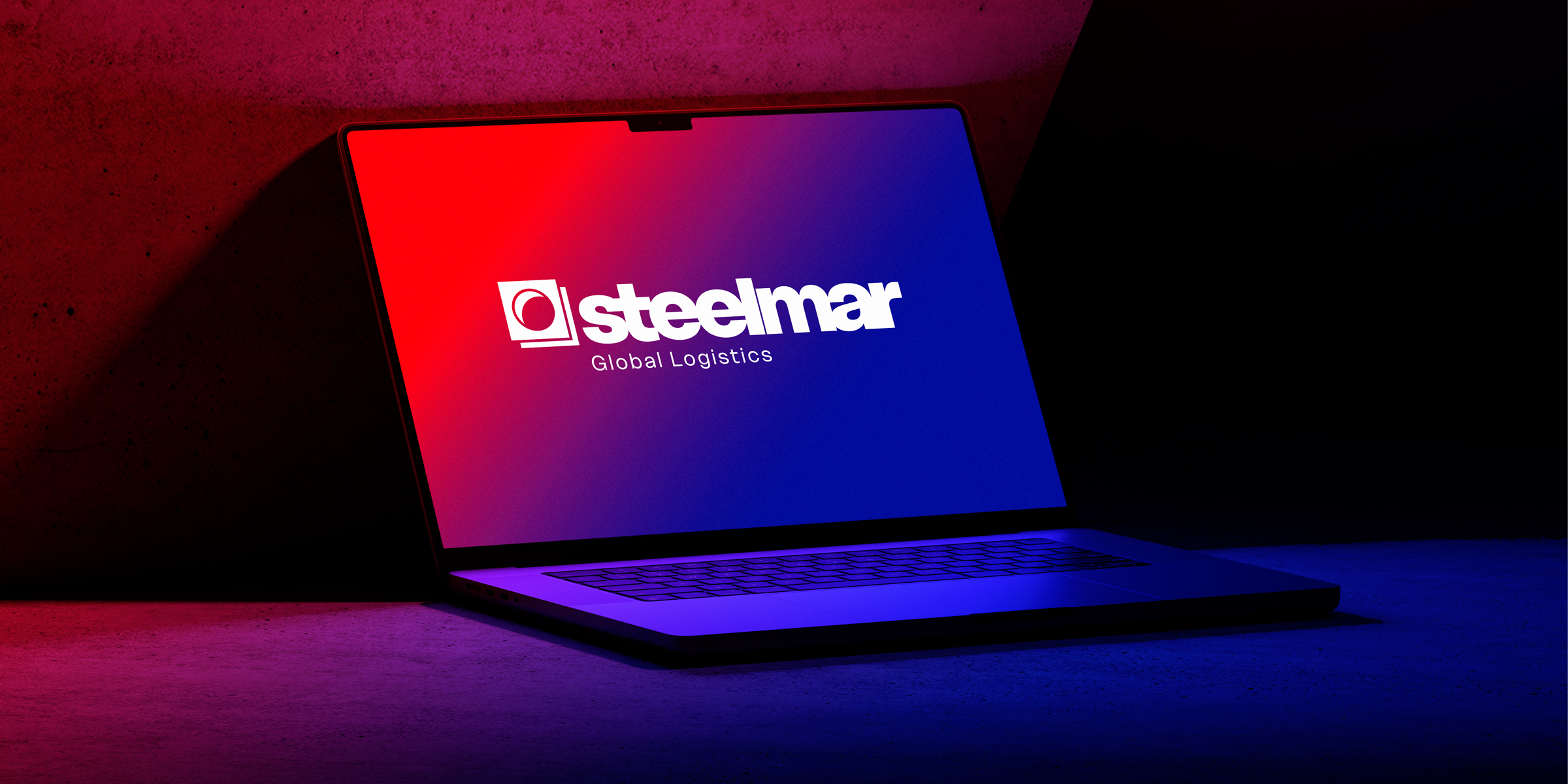
At Singularity, we believe a rebrand is so much more than just refreshing a logotype, it’s about redefining how a company is perceived. Steelmar approached us with a clear challenge: their brand was too anchored in a maritime perception. While their name carried an ocean reference, their reality was far broader. They had evolved into a global logistics partner, offering multimodal transport, warehousing and distribution.

To reposition Steelmar we immersed ourselves in the competitive landscape. We saw that if the focus remained only on the ocean, the brand risked being perceived as limited compared to what they actually offer. We needed to move beyond the ocean and capture the full dimension of their services.

Outcome

We created a new identity that neutralised the references to the sea and eliminated direct references to maritime transport, positioning them among the leading logistics brands. At the core of the redesign is the logo, built on two key concepts: the container as a symbol of industry and trust, and the destination as a reminder of every journey’s beginning and end. These elements merge into a geometric, three-dimensional symbol paired with a bold typographic wordmark. The lowercase letters humanise the brand while the deep blue and red color palette conveys confidence and reliability. 

What made this project especially meaningful was guiding Steelmar from an ocean-bound identity to one that reflects its full scope as a trusted logistics leader.

Scroll up Drag View