First things first, let’s craft the perfect packaging.
Contrary to popular belief, sometimes beauty on the outside is more important. How many times have we been handed a present and immediately stopped wondering what’s inside? Instead we have focused on the beautiful packaging. And if re-gifting becomes a likelihood, the packaging can end up being the best thing about a present.
Packaging matters. It is the first tangible, visual input we have of a brand when being introduced to its product. Colours, words, and shape are enough to portray the brand’s personality with just a quick glance from the user.
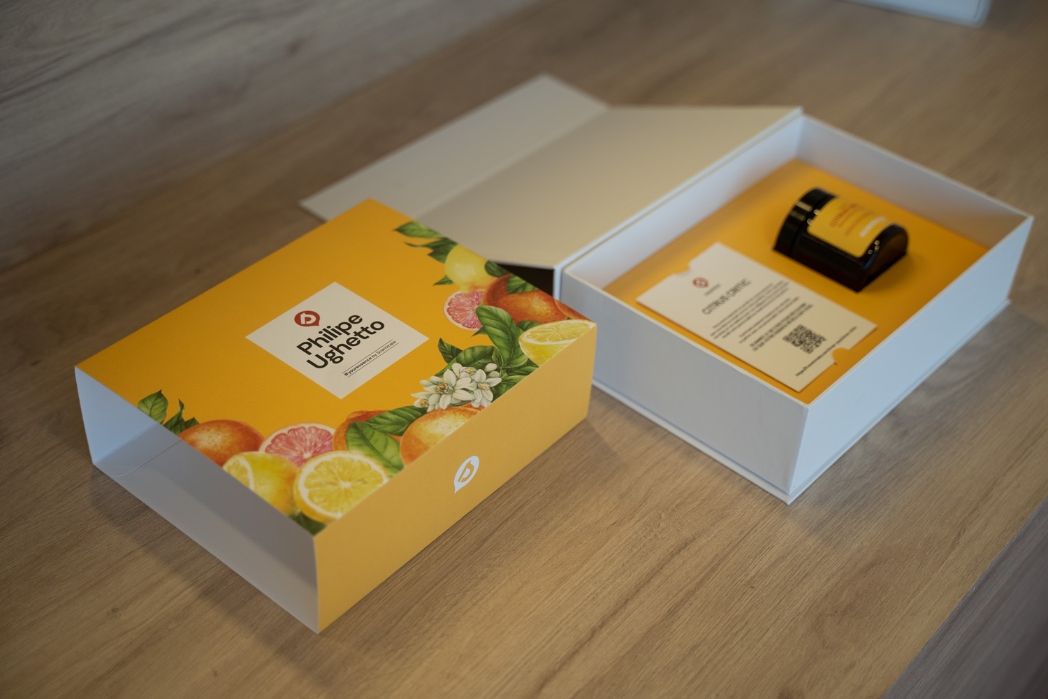
When creating the first PR action for our client Scentmate, we crafted the perfect packaging to introduce them to the world.
A box that contained the specially curated scent told everything that needed to be conveyed about Scenmate. Opting for the tranquility of pastel colours, such as a delicate pale blue, dusty pink, or lush apricot, we created different, floral patterns to introduce the brand as a fragrance company. These design choices provided a visual coherence to the whole project without the need to make all designs look identical.
Of course, Scentmate’s logo was a mandatory element, to be included front and centre throughout packaging development. That is why it was placed at the heart of the composition, right next to the name of the recipient, and also in the box itself as a stamp.
We don’t know what the lucky unboxer ended up enjoying the most, the gorgeous packaging or the present itself. But we are sure they loved both.